Visual Experience Light or Dark Mode
Enhance Your MojoCP Experience
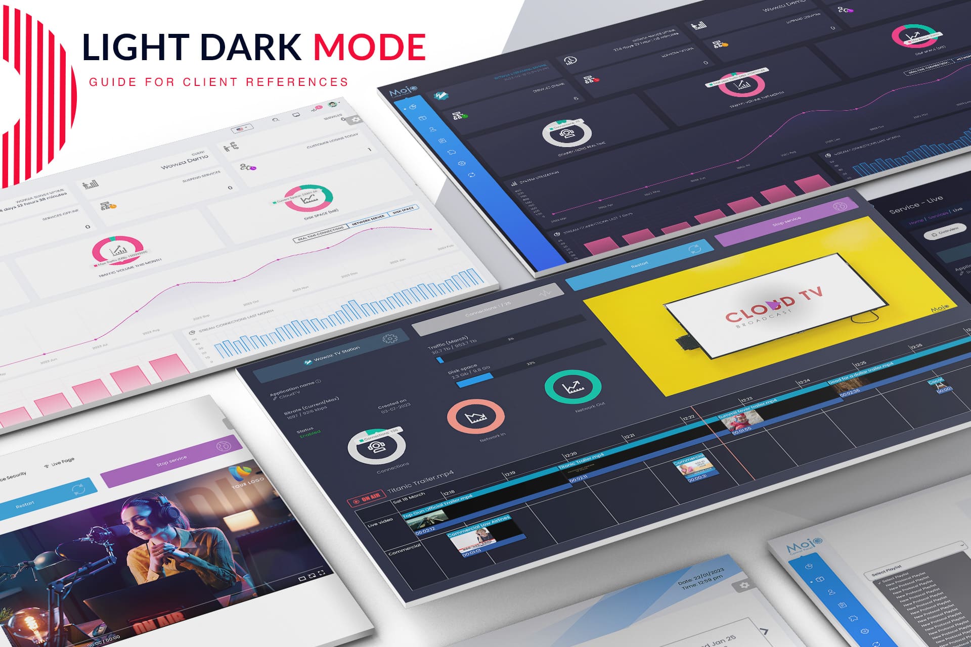
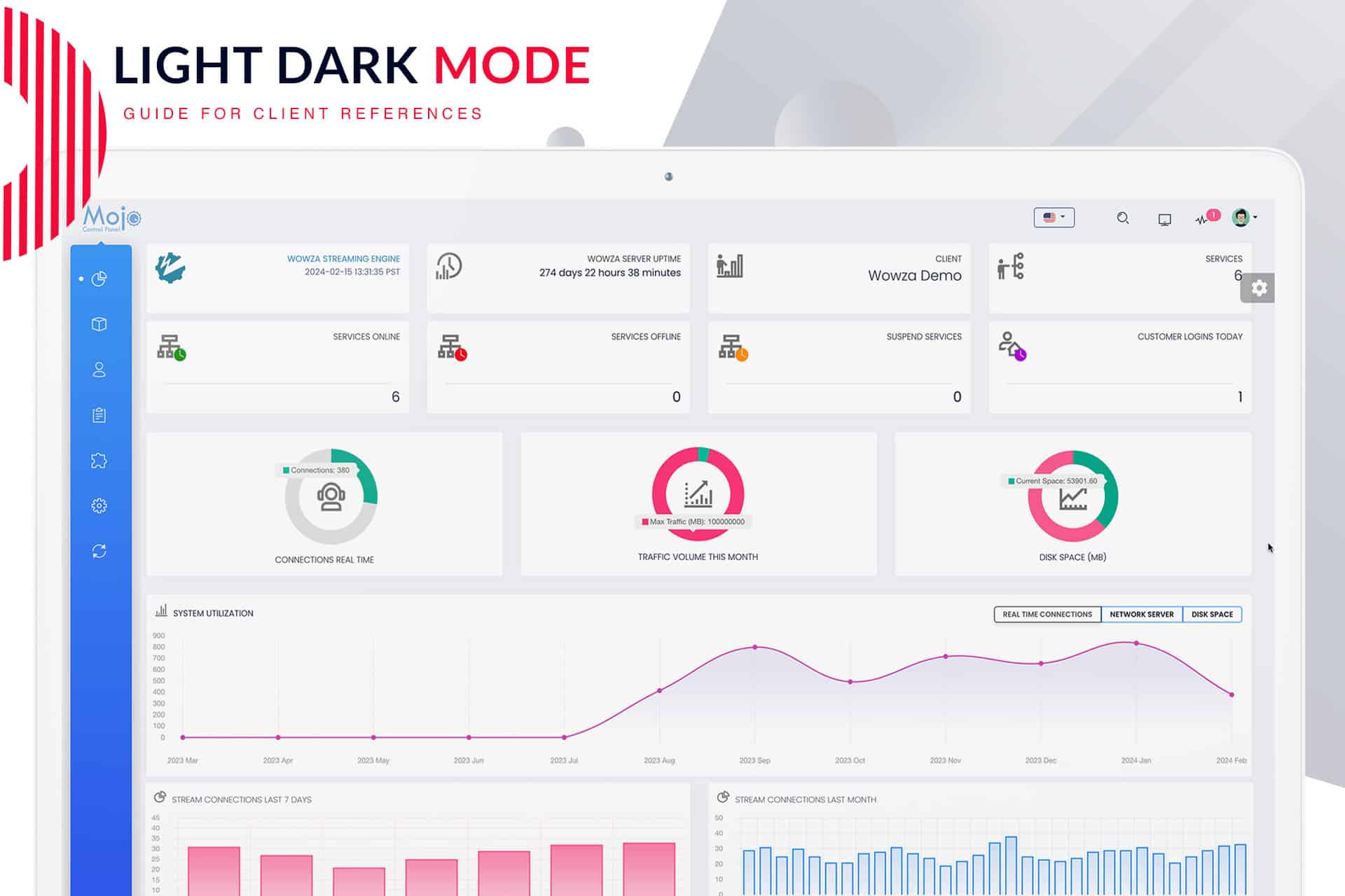
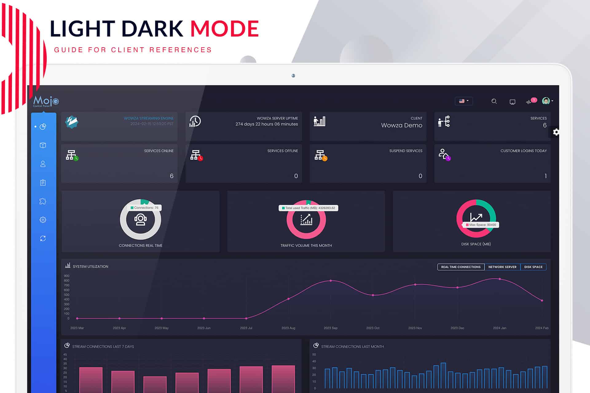
You can significantly improve your MojoCP experience by choosing the appearance that best fits your style—light or dark mode. In Light Mode, the design features bright backgrounds with dark text, providing a lively and clear view that is easy to read during the day. On the other hand, Dark Mode showcases dark backgrounds with light text, which creates a calm and easy-on-the-eyes setting. This mode is particularly beneficial for low-light environments, allowing you to work comfortably without straining your eyes.
Easy Switching Between Modes
Moreover, switching between these modes is incredibly simple and can be found in the user settings section. As a result, this convenience allows you to adjust your MojoCP experience based on your comfort and the lighting around you. Additionally, changing modes is quick, enabling you to adapt your interface based on your needs at any time.
Customize Your Interface
In addition to choosing between light and dark modes, users can also select an accent color for menus, buttons, pop-up menus, and other UI elements. Not only does this feature ensure a fully customized and visually appealing interface, but it also allows you to match your style. For example, whether you prefer a soft blue or a vibrant red, you have the freedom to create a workspace that feels just right for you.
Seamless Integration Across Platforms
Furthermore, this customization extends to web page integrations, which provide a smooth and personalized experience across different platforms. With MojoCP, you can maintain a consistent look, thus making it easier for users and visitors to navigate your streaming services.
Conclusion
In summary, by choosing your preferred mode and accent color in the MojoCP settings menu, you not only enhance your overall experience but also ensure that your interface meets your visual needs. Therefore, you can enjoy a user-friendly and stylish interface that aligns with your preferences, making streaming management more enjoyable.
Click to zoom in on the image
Effortless Light and Dark Mode Switching:
Effortlessly customize your MojoCP experience by switching between light and dark modes. Follow these simple steps to illuminate or dim your dashboard:
Navigate to Your Dashboard:
- Streaming Pulse Inc.
Access your MojoCP dashboard to initiate the customization process.
Slide Menu Icon:
Located on the right side of your screen, click on the Slide Menu icon for quick access to customization options.
Light or Dark Mode Option:
Within the Slide Menu, discover the option to seamlessly switch between light and dark modes, adapting your interface to your preference.
Mini Sidebar On/Off:
Tailor your dashboard further by toggling the mini sidebar on or off, optimizing your layout for a personalized view.
Accent Menu and Background Color:
Dive into additional customization with the ability to choose your preferred sidebar menu and accent background color, adding a touch of personality to your MojoCP interface.
Enhance Visibility and Comfort
Elevate your MojoCP journey by seamlessly toggling between light and dark modes. Prioritize visibility and reduce eye strain with bright backgrounds or embrace a soothing, low-light environment. Your preferred mode is just a click away, providing a visually optimized experience tailored to your needs.
Customize Your MojoCP Experience
Tailor your MojoCP interface effortlessly with the option to switch between light and dark modes. Illuminate or dim your dashboard to match your preferred ambiance, ensuring a personalized and comfortable user experience.


